This is the Story About the Story of the 100,000th Big Cartel Store (Part 2)
- 28 October 2010
- ByDan Christofferson
- 6 min read
When we opened the 100,000th Big Cartel store, we knew we wanted to mark the occasion by doing something special.
Dan had produced a wonderful print piece, composed of pictures and type, that beautifully told Lillian’s story. Naturally, we wanted an online component to share Dan’s piece and our excitement for Lillian’s store with all of our friends and customers. The question now was how to do that and remain true to the story Dan was telling–in terms of both content and aesthetics. From the opening page, his use of type was integral to the tone of the piece. We needed to capture this feeling on the web in a way that complimented both the story we wanted to tell and the medium we were telling it with. We had a few ideas along the way.
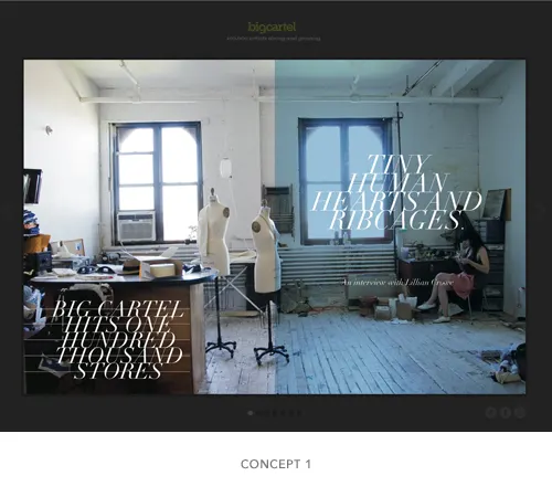
We first explored a more literal translation - essentially taking the pages from the story and creating a slideshow. This solution was a bit static and seemed to neglect some of the basic properties of the web and how folks interact with it. But it was true to the original piece and carried through the feeling we were after. We quickly decided we wanted to explore a more developed approach.
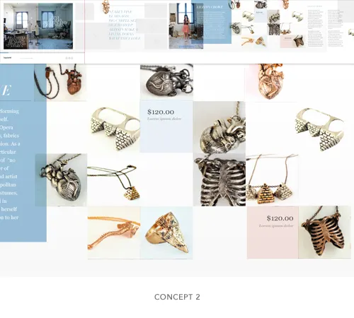
The second concept we considered drew inspiration from Lillian’s own work place. Scattered through out her studio are collections of metals, chains, artifacts, casts and materials she uses to create her jewelry. Each setting formed mini mood-boards, which inspired us to see how mixing elements from our story piece with some of the more organic qualities of her studio would play out on the web. We explored an atypical horizontal layout that complimented the mood-board effect we were after. This direction began to tell the story in a way that was more engaging and eventually put us on the path to the final iteration.
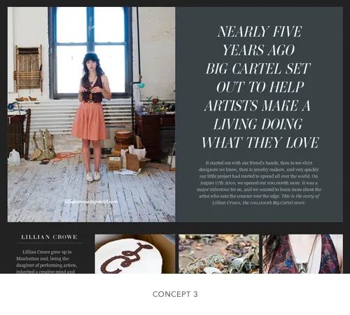
Taking cues from some popular designers in the community, the last and final concept explored an editorial format. Rather than just publishing another article to our blog, we set up a basic structure and created a look and feel that was specific to the content at hand - just like each article in a magazine is individually art directed to help better tell its story. Designers have been telling stories this way - with pictures and type - for, well ever. Sadly, until recently us designers who play on the web have had, at best, an abysmal selection of typefaces to work with and to achieve intricate editorial esque layouts were a feat of themselves. To go outside of the norm (Arial, Verdana, Georgia and in layout) meant using Flash or other similar, laborious workarounds. This is slowly changing. Our attention can shift back from implementation to what we do best, craft and story telling. Pictures. Type. Story. It’s an effective combo when all of the pieces are playing well together. But it’s not always easy.
Know your medium
Obvious statement is obvious. But, how many times have major print publications gotten it wrong when bringing their content online? I don’t claim to have a lot of answers and this topic has been discussed at great length by many a peoples more qualified than I, but here are a few principals that shaped our article and helped us move our offline content online.
The web is fluid
It’s always moving. Your content will be digested on many different devices with varying form factors. Pin point a few key devices to target and design the best possible experience there, while still accounting for secondary environments where your content will surely pop up. Our primary focus was in the desktop experience. We started with the best modern browsers and built down from there. We turned to Typekit to help us recreate the look and feel Dan established typographically. Type on the web is expected to be selectable and malleable. Only a few years ago, to achieve the high design we were after would have meant an obscenely heavy use of images or Flash. Typekit offered some great typefaces that gave us the feel we were after. All text, no images. The latest builds of Webkit based browsers (Safari, Chrome) offer some really exceptional advanced CSS properties that you should use to your advantage. -webkit-font-smoothing will do things to your type that you could have never imagined. Check out this great blog post for a more in-depth break down.
Accentuate your assets
Your offline content lives in a finite space. Lots of great creative assets go by the way side due to size or printing reqs. There were a lot of rad photographs Dan didn’t have a chance to include in our print piece. We brought all of those assets online. Offer your readers something more than what’s in the print version.
We want to touch your content
It’s true. There are unique interactions that happen online that the print world just doesn’t offer. In our piece we showcased some of Lillian’s products and linked readers directly to her store. We also had ways for people to share and download an electronic version of our printed article.
The days after we had published the article, readers were remaining on the page for approximately a minute and 20 seconds. They were reading the article! These basic principals inspired a creative, editorial layout that really did engage our readers. It told a better story.
28 October 2010
Words by:Dan Christofferson
Tags
- Share