Sidecar Theme Updated and Mobile-Ready
- 8 May 2013
- ByBig Cartel
- 2 min read
Sidecar just got a makeover, and we think it's looking better than ever.
We’ve completely rebuilt it from the ground up, keeping all the features you love and introducing some new ones as well.
New Sidecar features
Responsive - That’s right, Sidecar is now optimized for any type of mobile, tablet, or desktop device.
Updated assets for HiDPI devices - This means your shop will look beautiful for anyone and everyone.
Optimized the entire theme - Your store will load faster making it a better overall shopping experience.
Added forward and backwards compatibility utilizing HTML5 and CSS3.
And, last but not least, we made some subtle updates to the design and added in smooth layout transitions.
The new version of Sidecar is already available in the admin. To get started simply log into your store, and choose the Sidecar theme in the design area. Preview, hit save and you’re set.
What if I’m already using Sidecar?
That’s easy, you’ll just need to backup your existing customization, then revert your theme to default to access the upgrades. Once you’ve got the current version of Sidecar, get back in and apply your customizations and you’re good to go.
Sidecar now joins Luna in the modern responsive world, and we’ll continue to bring more responsive themes to you moving forward.
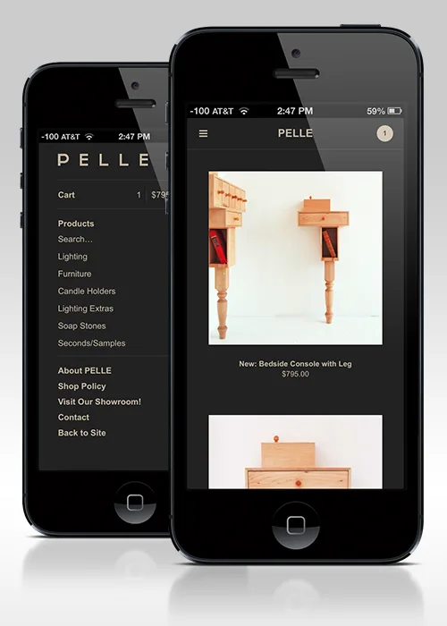
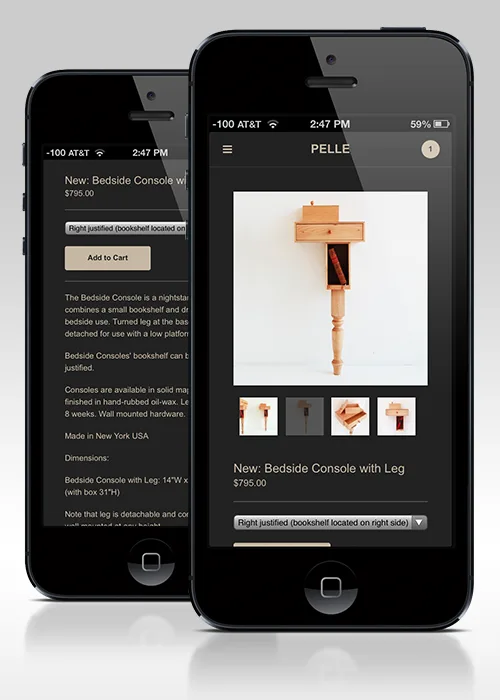
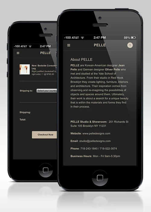
See the new and improved Sidecar in action in the Pelle shop.
8 May 2013
Words by:Big Cartel
- Share