Creating with the Colonizer’s Tools
- 18 February 2021
- ByCamille Gomera-Tavarez
- 2 min read
There is a scene in the Netflix reality competition “Next in Fashion” where the guest judge, Kirby Jean-Raymond of Pyer Moss, gets into a heated argument and leaves the room after disagreeing with the other judges’ critiques of a duo of Black women designers.
The challenge is streetwear - a style known for heavily appropriating urban Black culture. None of the judges understand why Kirby is so upset, not even the other judges of color. In the end, the Black women are still sent home. It is a scene that hit me deep in a familiar wound. The design world judges Black designers, students, and other people of color harshly for their lack of “clean” finishes, while discounting the vital role they historically played in innovating within the field itself.
We are still asking - in the year 2021 - why it is so difficult for artists of color to thrive in creative industries. As a young designer, I can only speak from my particular experience as an Afro-Latina dealing with this issue as it exists in the field of graphic design. Here, I can point to a very specific problem that exists within design education. Design is supposed to be a tool to solve problems, but it is clear - when it comes to addressing diversity, that the call is coming from inside the house.
Now, all artists and creatives experience white supremacy within their field, no matter the discipline. Racism is reliable like that. But in my experience (having attended a fancy art school), there was something specifically sanitized and off-putting about the graphic design department. There was just something about the way people of color often switched out of the major, dropping like flies. Freshmen would come in wide-eyed, wanting to change the world, and end up absolutely hating graphic design within a year.
Rather than recruiting token Black students to boost low retention numbers, maybe institutions should examine the ways in which their spaces prioritize whiteness instead?
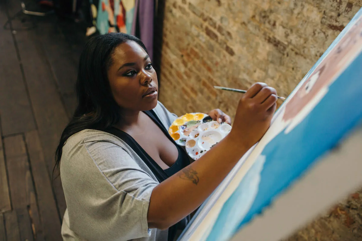
Working in the Center for Diversity at my college, the departments I heard the most complaints about were the graphic design department and the painting department. But, for some reason, there were still a good number of Black painters sticking with their major. It took me a while to realize why this was. While painting is a tool of personal expression that has been tied to freedom and countering systemic oppression for centuries, graphic design is often the tool of oppression itself.
Design is fundamentally linked to gentrification, colonization, and capitalism. You don’t design for yourself, you design for a higher person, a company. You exist within a hierarchy - intern, junior designer, senior designer, head of design, creative director, editor, etc. The work you design is meant to be neutral and it is a failure if you put too much of yourself into it. Especially if you, yourself, are not representative of the majority audience (most often white).
For some people, having the ability to divorce your work from your culture is seen as a positive. I asked my friend about why she often chose not to make work about being Black. “I got annoyed by non-people of color expecting my art to have some connection to my heritage. As I developed, learned new skills and started to do art/design things outside of the typical Black narrative, my professors and peers truly started to critique me. Before that, it felt as though they didn’t know how or shouldn’t.”
We could take almost any element of design that we are taught and point to the ways in which it has harmed marginalized communities.
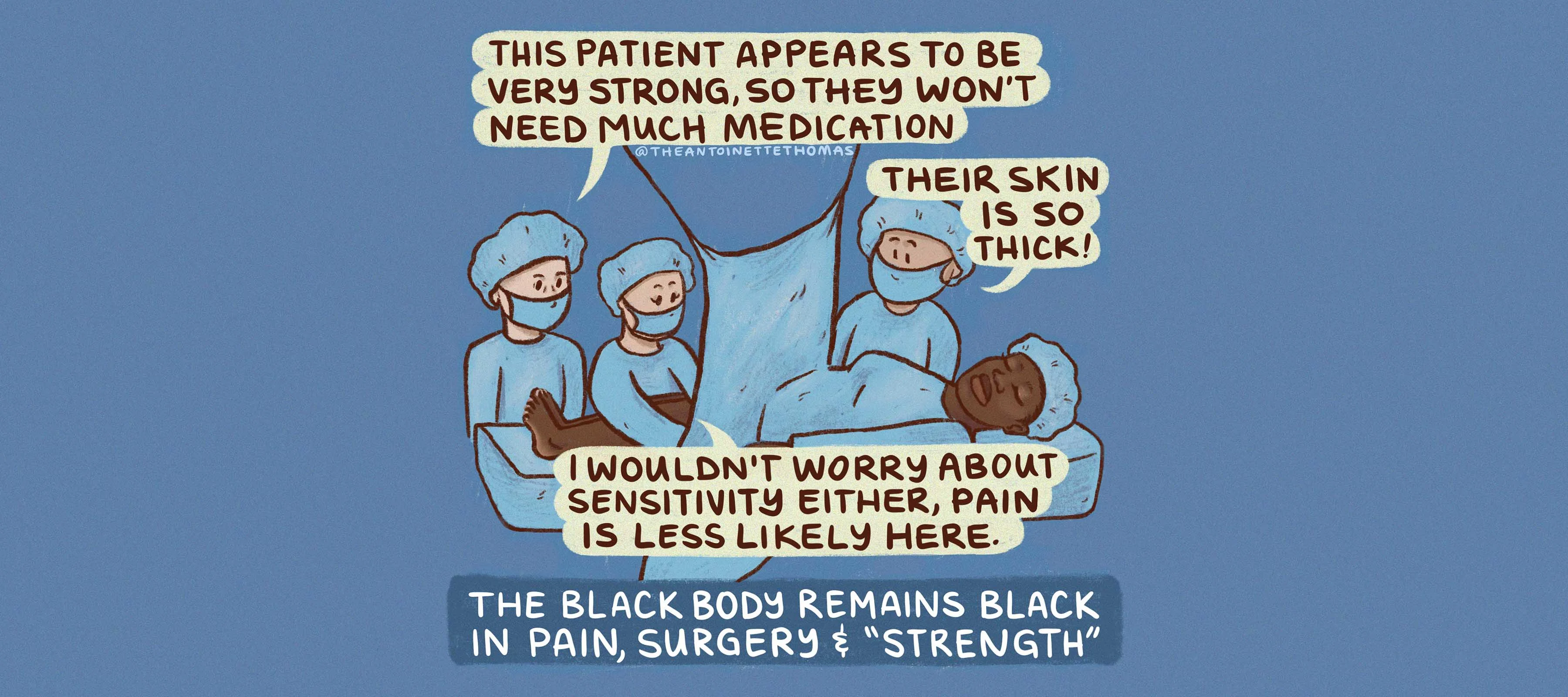
Minimalism is racist and classist. Designers learn about a lot of Mid-Century European designers like the architect Adolf Loos, who believed that “less was more” precisely because they found adornment and intricacy to be “degenerate” and tribal - clearly coded racial language. Maximalism, lavish decoration, and pattern are markers of traditional Native and African design, but they are put at the bottom of an aesthetic hierarchy. Students of color are then aggressively pushed into simplifying their creative sensibilities and many teachers critique them harshly or fail them if they don’t adhere. This was as true 50 years ago as it is now, as shown in this 1968 article from PrintMag surveying Black graphic designers. A woman in the article states, “I do not think that I have ever experienced so much discouragement and suppression of black artists... art instructors treat the black student as though he were some out-and-out freak and a tremendous threat to the instructor, when all the student is trying to do is develop talent.”
Design students also learn about the breakaway from clean European minimalism through modern designers like Saul Bass and Paula Scher. Their work is meant to signal the birth of a uniquely “American” design sentiment that uses dynamic lettering and movement. We learn that they are inspired by rock music and jazz, but the bold cut-out style of their work is very clearly an African American aesthetic, just like jazz is. Making posters out of collaged shapes and words that show movement is something that Black ad designers and illustrators did as soon as Black publications and music existed (to save money usually) - especially with the rise of hip-hop parties in the 80s - yet their names go unremembered.
Most of the things that make up American culture as a whole stems from the struggle and innovation of African Americans throughout history. It seems silly to think that American design would be any different. Design is the tool with which racism and intolerance is often written. You see it with propaganda posters, TV ads, MAGA hats, and even with Aunt Jemima’s packaging. It is powerful and eerily effective in convincing people that participating in white supremacy is nice and clean and trendy.
Even design that is meant to be “neutral” and “modern” is tied to this stained history. There is a thread on Twitter about knowing when you see a certain font pop up on buildings that the neighborhood is about to be gentrified (basically anything resembling Neutraface, Avenir, Futura). Regular people, without design knowledge or art sensibilities were able to recognize spaces meant for upper class whites simply by the building fonts.
As a graphic designer reading that, I was both amused and embarrassed to think that I had once believed that redesigning brands and urban spaces with similar fonts was somehow making them better. Here, more than anywhere else, it is easy to see how the design we create sends a very real message about who a space is and isn’t for. Black people and people of color in the community do not see themselves in that design. Why should they? They were clearly not thought of by the designers or the companies.
So, how can a Black person or person of color, knowing this dark truth, ethically produce work in the design field? In my case, I was freed a bit once I broadened my definition of the word “design” and stopped worrying about following the rules of design. Who cares? I’m not being graded anymore. If I want to make a sculpture or screen print or paint or write a book for a client and I say it’s design, then who can tell me otherwise?
There is a sort of autonomy in this thinking that separates from the formulaic design thinking that guides most everyday design. It allows me to step away from Photoshop and pick up a brush pen if I feel like it. Hell, even use multiple bright colors (what a concept!). When you create unique work, even though it is not “universal,” it establishes a voice that only you can create and attracts people who want your particular uniqueness.
Broadening the definition of design also helps find education outside of white, European design history. A history, which by the way, somehow includes lengthy lessons on design for Nazism and fascism, but not Black people?
There are so many angles of design history that include Black people if you are willing to do the work. Print design for Black music, like album covers, hip-hop flyers, fashion, and more can be found in “As, not for, Dethroning Our Absolutes,” an exhibition by Jerome Harris. There is a growing online database called Decentering Whiteness in Design History with everything your professors forgot to teach you. Ebony and Jet magazines have historic archives you can view on Google Books featuring innovative magazine layouts and amazing advertisements for Black products. Graffiti is a beautiful form of graphic design. Articles like this one on why Cholo gangs in LA use Black letter traditions in their graffiti are the kind of thing I wish I learned more about in school. So much more research is needed to bring to light the countless other examples of non-white design throughout history.
Once you see design as anything and everything, it’s also easier to realize that alternatives to feeding into colonization and capitalism do exist. Black and minority-owned businesses need business cards and flyers, artists and non-profits need logos and presentation decks, and community projects need structure and organization. It is important to dispose of the learned notion that you must improve these minority organizations with “clean” design, and instead work with them to create things they actually want and need.
Having a tool for convincing people to do good things is powerful. Even though people often peddle the notion that non-corporate work is less lucrative, I just work on the faith that it can be as lucrative as I need it to be, and that the clients I want to work with are out there. You can absolutely push even further and create the opportunities for yourself.
To borrow the iconic phrase from Audre Lorde, the master’s tools cannot dismantle the master’s house, but when you know the sinister ways in which the master's tools disguise themselves as “problem solvers” and “neutral” you are better equipped to make conscious decisions to counteract them. And more important, to help the next person navigate a creative industry built to suppress them.
18 February 2021
Words by:Camille Gomera-Tavarez
Tags
- Share